Touchtech Vendo
CMS Interface
The design of a simple content management system used to control Touchtech Vendo, a digital retail solution bringing e-commerce to the physical store.

About Touchtech Vendo
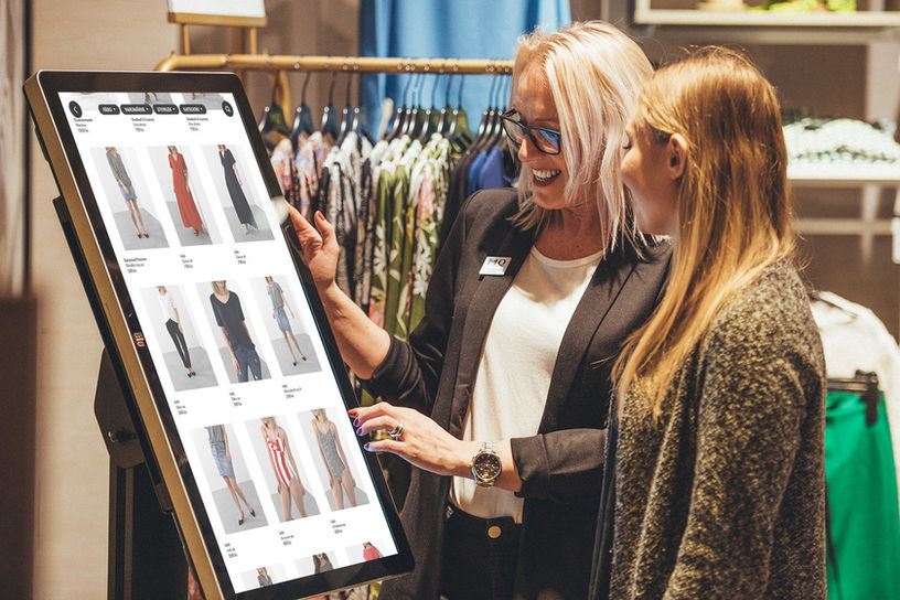
Touchtech Vendo is a retail solution that connects the physical and digital shopping experience by allowing customers to place orders and view products online in the physical store. The in-store displays show so called menus, normally composed of category and product grids that the customer can buy from.
These large displays were not the focus of our project however, but the web content management system (CMS) behind it all, in which these displays were managed.
About the CMS
The CMS is a web app used for managing the large in-store displays - for instance displaying which displays are online, the products they display and what purchases have been made.
The CMS is also used for collecting sales statistics and overviewing products. This results in many different users with different goals, ranging from employees from different departments as well as partnering companies and store staff.
What was the brief?
Due to the large numer of users, it was very difficult for people to perform their different tasks the original CMS which lacked a lot of functionality. For instance, the platform lacked continuity and it was not possible to see display status, statistics or add new products. Therefore, we were challenged with the task of designing a new user interface which better accommodated for all user needs.

How we approached the task
We accommodated an investigative and iterative approach where we first had to gain an understanding of the old systems being used, the users and their work before moving on to the design phase.

PRE-STUDY (1)
To gain insight into the task at hand, we did some reading on the functionality of content management systems and interviewed the main users of the old platform. These were employees from sales, development, IT/support, operations, project management and product development who, in semi-structured interviews, told us about their tasks and how they use the system in their work. We did the interviews two-and-two where one handled the questions and one took notes.
“It should be easy to navigate and get a clear overview [...] it is not just about adding the info we want."
“It would be nice to be able to do and publish the menus in the CMS myself.”
“I see the analytics view as a tool for statistics, but not everything is working, everything is not there yet.”
We also interviewed a representative from a partnering company and staff from a store chain where the digital retail solution is used. All in all, the interviews provided in-depth and broad insights into areas of importance.
ANALYSIS (2)
To get an overview of all the interview findings, we did an affinity diagram which grouped recurring statements and quotes.

Requirements
The most important findings were turned into general requirements for the CMS that would guide the design process.
OVERVIEW
Provide an overview of important info and functionality.
CREATION
Provide a tool to create, edit and publish menus within the CMS portal.
CONFIGRATIONS
Provide options to alter a wide range of screen settings.
READABILITY
Allow all users to work with and understand the CMS functions.
BEHAVIOR
Give overview of customer behavior, session and checkout status.
FILTER
Provide the user with tools to filter and sort content.
STATUS
Display on/off status of each screen.
NAVIGATION
Minimize the time needed to understand the portal navigation and layout.
STATISTICS
Provide an overview of customers sale statistics.
Thanks to the requirements list and the important topics from the interviews, we were able to determine what functionality the system would have to include. These formed the main views of the CMS.
IDEATION (3)
Without looking too much at the design of the old CMS, we began sketching on how to implement the functionality we had found was important. Designs and layouts were chosen by dot voting.


Wireframing
We divided the CMS's views between us and started transferring the best aspects of the sketches into digital wireframes using Figma. As you can see, the wireframes are very different in style, which allowed us to evaluate a wide range of ideas and not settle for the very first one we came up with.


Each of the four wireframes above was created by one of the four team members, allowing us to design without being influenced by each other. We could then look at a wide range of ideas and merge the best attributes and designs together to form a coherent and intuitive UI.
PROTOTYPE (4)
Due to the large scope of the project, there was no time to evaluate the concept through user tests. The designs that were handed over to the company were however thoroughly iterated on in terms of design, layout and interaction flow. Below is the final design of the new CMS, divided into a the following views.


The mock-up above shows the aesthetics of the new CMS in a look-and-feel prototype. Below, I will show each view in more detail, explaining their functionality and talk about a few design choices. I will walk through the navigation menu at the left from top to bottom.
OVERVIEW
When entering the CMS, the user is presented with an individual dashboard with quick access to content commonly displayed.


The orange notification icons will let the user know if the screen has encountered any unscheduled shutdowns or other errors.
The detailed view offers a range of settings for the screen, such
as country, language and time that can be expanded on demand.
The menu design on the right can also be selected through a drop-down menu.

When clicking on a list element or thumbnail, the user is presented detailed information about that particular display.
This view gives an overview of all displays a store/company have, where they are located and a preview of the currently connected menu. New screens can be connected using the blue button at the bottom.

A toggle switch in the upper right corner allows the user to change between thumbnail and list view. There are also a few different search and filter options to facilitate finding a certain screen.
SCREENS
The Products view show all items of a specific store or customer. The overview provides a thumbnail, name, art. number and price for quick access to important details. The orange notification displays if an item has run out of stock since last log-in.


When clicking on an item, more details are provided. The user can see and alter the description and images that are visible to the customer when they tap the item on the display in the store.

MENUS
The Menus tab shows all the menus (touch-screen UI) that are available for a brand or store. They can be viewed as thumbnails or as a list using the toggle on the right.
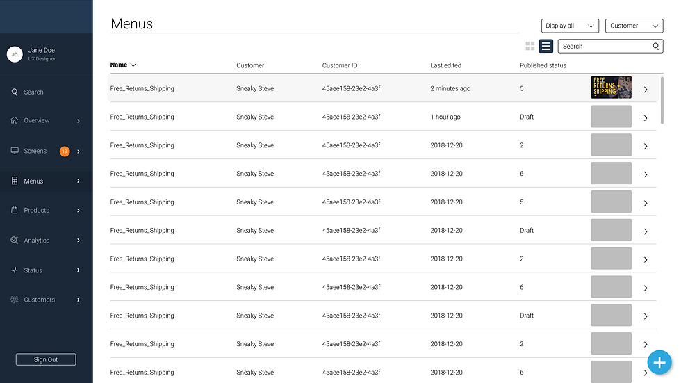


When an item is clicked, a detailed view will open, allowing the user to re-design the menu design by selecting a layout and linking categories, images and pages from the online store.
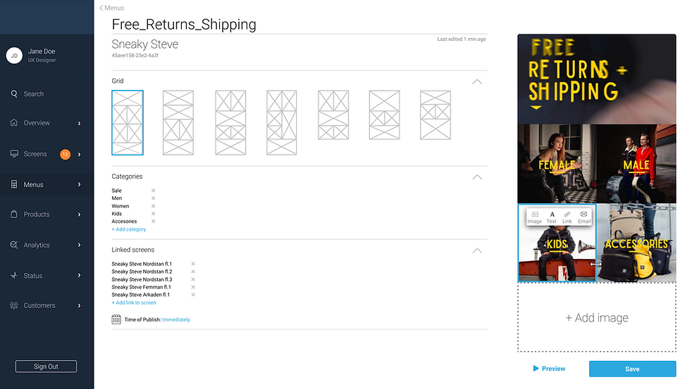
The detailed menu view also shows a list of all the screens that particular design is linked to as well as options for auto-publishing new menus, for instance along with new campaigns and seasons.
PRODUCTS
ANALYTICS
The Analytics view is divided into two tabs: Sessions and Checkouts. The landing page shows a dashboard-like overview of the chosen customer or store over time, or in a set period of time.

When clicking the Sessions tab, the user is presented statistics of how many times each screen has been used by a new customer.

Clicking one screen in the list will open a list on all sessions made on that particular screen, what date they took place and how long the session lasted. When selecting one of the sessions, a detailed view will open on the right, showing what views were opened and what interaction flow took place.
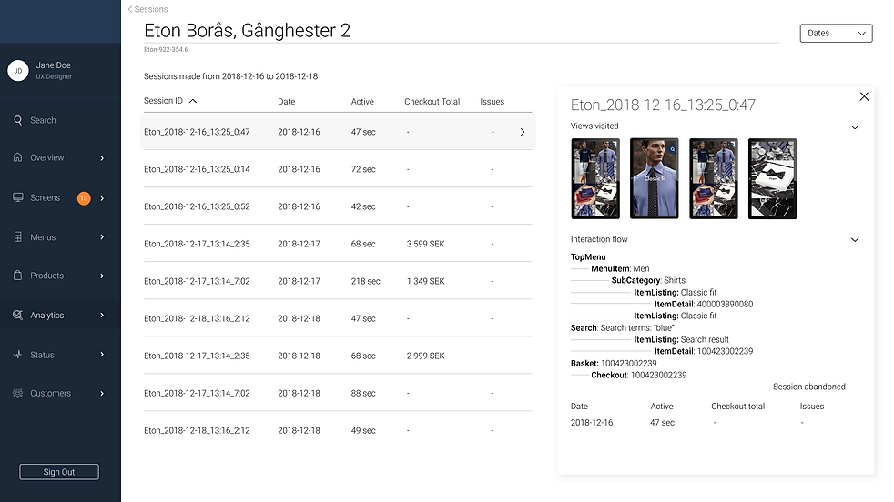
Using the "back" arrow and then clicking the Checkouts tab on the Analytics page will show the user an overview of all the sessions that resulted in a purchase.
The overview gives information about Checkout ID, Date & Time, Location, Price etc. The user will also be able to connect the purchase to a store associate which was requested in the interviews.

Finally, the last menu tab shows an overview of the brand's customers, their customer ID, how many stores they are connected to and the number of screens that are installed. An overview of sales income is available for the last period as is contact information and further options once a list element is opened.

CUSTOMERS
WHAT I LEARNED
All in all, I learned a lot about designing a system for a wide range of users, how to prepare for and conduct interviews as well as analyze the gathered data and summarize it into user goals and requirements to design for. I also learned a lot about Content management systems and a number of key points that we found were extra important to accommodate for:
CMS
• Create, enhance and customize content
• Overview content and functionality
• See sale statistics and details
• Publish content on different devices
• Use system without prior experience
• View status of connected devices
• Provide functions that suit different users
• Add and remove devices from the system
• Create drafts and demo files
• Allow for flexibility and customization
